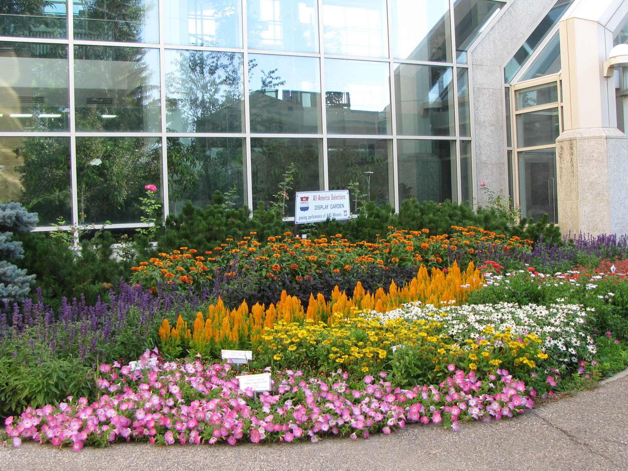
Colour in the garden
colours and mood
How do you know when you’re in a garden that has been well designed? The colour scheme works. What does that mean? It means that the flower colors are actively selected and the overall colour scheme is doing something. Perhaps the colors are creating a mood, enhancing the other plants around them, or are contributing to the overall theme of the garden.
Many gardens are “busy” because many of us don't actively design our gardens. Instead, we buy a plant we like and then find a place to put it once we get home. This approach is fine, especially in new gardens or informal gardens, but it tends to create hodgepodge of colors. It is a lot like looking at a box of crayons; it's an interesting rainbow, but with no discernable pattern or idea. This can be fun, but it's rarely cohesive or relaxing. If you're seeking a more formal design, color is an important consideration.
When you create a garden, you are an artist. Studies have been done all over the world that indicate that colors affect mood, atmosphere, and body chemistry. People are more productive in a blue room. In a red room, people get more frequent headaches. Studies also show that babies respond to color in different ways. So do children. Little girls, for example, are almost irresistibly drawn to the color purple, in all shades.
In the garden, you want to create a mood, and a feeling. You have the power to change how someone feels. In your garden, you can make someone feel happy, relaxed, calm, vibrant, or any combination of these things. The way you do that is by using color wisely.
Chromatics
The science of colour
The science of color is called chromatics. Making a color darker is called shading, while making a color lighter is called tinting. Intensity refers to the brightness of the color. Color is an enormous communication tool.
If you are very new to working with color, one way to make a pleasing color scheme is to do something monochromatic. This means you choose one color and it is the main color you use in the garden. This can be done in various shades of said color, for example, if you choose purple, you can use lavender, plum, burgundy, violet, etc.
Complementary colors provide high contrast. They are directly across from each other on the color wheel, such as pink and lime green. Sometimes, you want strong contrasts, such as combining deep gold with vivid lilac. Other times, you want colors to harmonize, such as blues and pinks.
Black, white, and grey are considered “neutral”. Warm colors, such as oranges, red, and golds seems to move towards you, while cool colors such as blues and purples seem to recede, and move away from you. These are subtle things that most people are not consciously aware of, but they are powerful tools for giving an over all “feeling” to your garden.
When it comes to color in the garden, here is the most important rule. The garden is designed by you, to please you. Above all, YOU must like how the garden looks, because you are the one who has to look at it. If you like flaming red next to sapphire blue, go right ahead. Combining primary colors is generally considered a thing not to do, but you know what? It’s your garden. Look at the laws and structures of color as a guide, but not an absolute rule. With that in mind, let’s look at some colors and how they are perceived and how they feel. That will give you some insight about how to use them in the garden.
White

Because white is considered neutral, it is safe to plant white flowered things next to nearly any other color. White is a common flower color, and there are also a large number of variegated perennials and shrubs to give you the element of white. White is associated with virginity and purity (think of wedding dresses), cleanliness, and creativity. (Think about a clean piece of white paper.)
White is excellent in dark, shady corners of the garden because it will show up well there. In a dim, poorly lit corner a planter of white begonias or white impatiens will glow. White also lends itself perfectly to night viewing. In bright moonlight, white flowers are highly visible. If you spend most of your time in your garden in the evening or at night, use as much white as possible.
The flip side of this is that white looks terrible in hot, afternoon light. It will appear bleached or washed out and will not be showy. Entire gardens of white flowers were once all the rage, made famous by Vita Sackville-West and her white garden at Sissinghurst, in England. A white garden need not be the entire yard, sometimes a hidden corner with a splash of white is just the thing! Good whites for the garden include roses, Shasta daisies, lilies, lilacs, and peonies.
Red
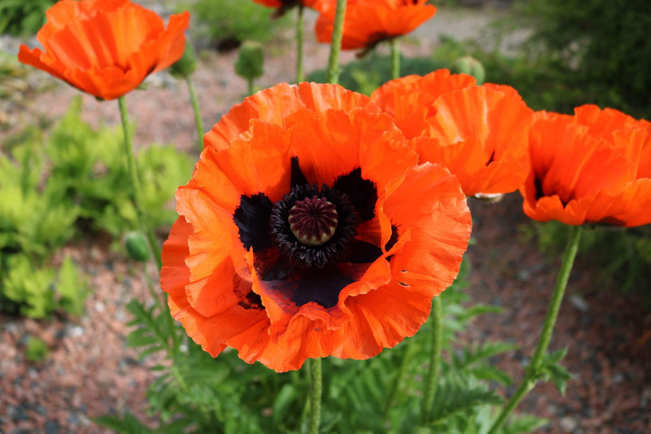
Red is best known as a “power” color, as anyone who has ever been to China can tell you. Red is associated with life (think of blood), power (many church officials wear red) and love. (Think of red roses on valentines day.) Red is the first color that the eye will notice, so a flash of red in the garden will be noticeable at once. Lots of red also makes people feel vaguely hungry, and using a lot of red in the garden will make a large space feel much smaller.
Red says movement and excitement and speed! It is a well known fact that there are more speeding tickets issued for red vehicles than any other color. Many people feel faintly out of breath in a red room. If you are going to use red in the garden, it combines brilliantly with oranges, yellows, golds, and even browns.
Red can also be combined with pink and will often stop people dead in their tracks when used with black. I once had a black ceramic pot overflowing with red flowers. I had to remove it because the contrast was preventing me from feeling calm. Good reds for the garden include bee balm, salvias, snapdragons, daylilies, and poppies.
Orange
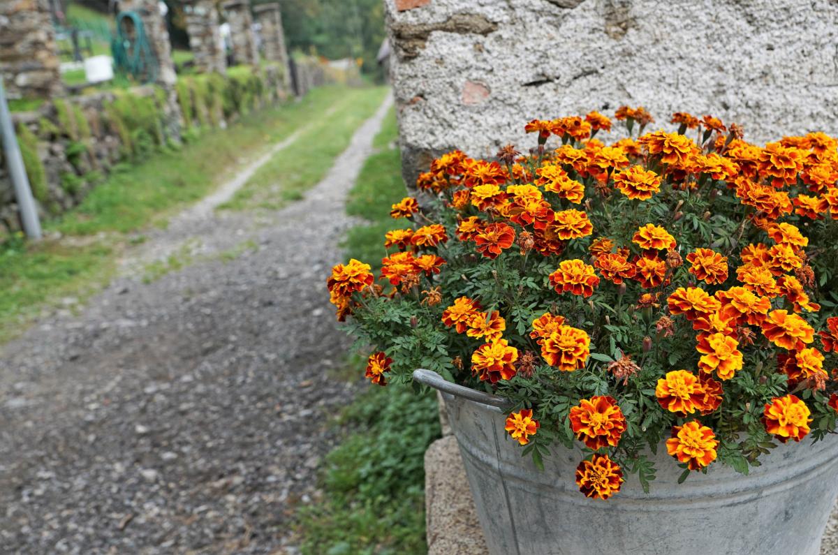
Orange is the least used color in the garden, perhaps because people do not know how to use it properly. When it is used, it is often used badly, which tends to make people shy away from it since they soon learn to associate orange with jarring or unpleasant. It doesn't need to be this way!
Orange is associated with fun, happiness, and energy. It can create a “tropical” feel in the garden and is also associated with ambition and abundance. (Think of pumpkins in the fall.) There is nothing even remotely calm about orange, so if you are trying to create a relaxing feel in your yard, this is not the color to do it with.
Orange combines very well with reds and yellows, but is often horribly at odds with cool colors. Keep in mind that there are also different shades of orange, and not all are created equal. Apricot, tangerine, pumpkin, copper, and bronze are all elements of orange. It is not a color to be feared, but a color to be used carefully.
Orange makes the best impact when it is massed; think of Hindu temples lined with orange and yellow marigolds. Orange does not do well when jammed into a confined space. Give it room to be as loud and brilliant as it needs to be. Good oranges for the garden include marigolds, tiger lilies, ‘Mandarin’ honeysuckle, sunflowers, and zinnias.
Yellow
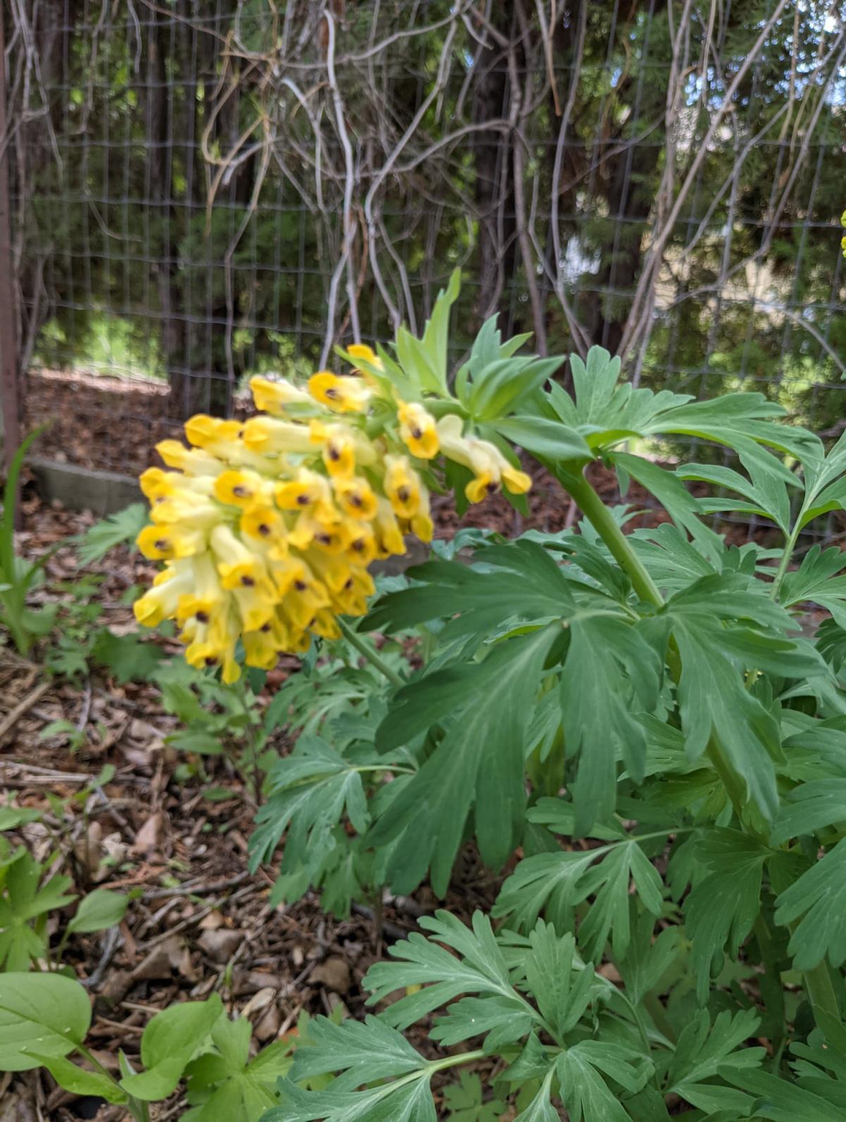
Yellow is the color of the sun. It is associated with laughter, happiness, optimism, and friendship. Studies have shown that yellow stimulates the brain to produce more serotonin, which creates a feeling of well being. Yellow is a very powerful color to use in the garden, and while it comes in a thousand different shades and hues, you must be careful with it. Too much or too intense a shade of yellow can burn.
Overusing yellow can be overwhelming, and a garden should not have that feeling. Too much yellow becomes associated with cowardice because too much yellow makes the brain want to flee. Too much dark yellow or gold becomes associated with illness or poor health. (Think of the yellow of jaundice or pus, or the yellow of a smoker’s teeth.) Studies have shown that babies cry more around yellow, but that when used properly, yellow also increases metabolism. Because of this, we recommend yellow as an accent or complimentary color, rather than the focus of a monochromatic garden.
Yellow is meant to be “warming” in the garden, just make sure you aren’t burning anyone with it. Good yellows for the garden include coreopsis, Siberian larch and birch (fall color), chrysanthemums, potentilla, and yarrow.
Green
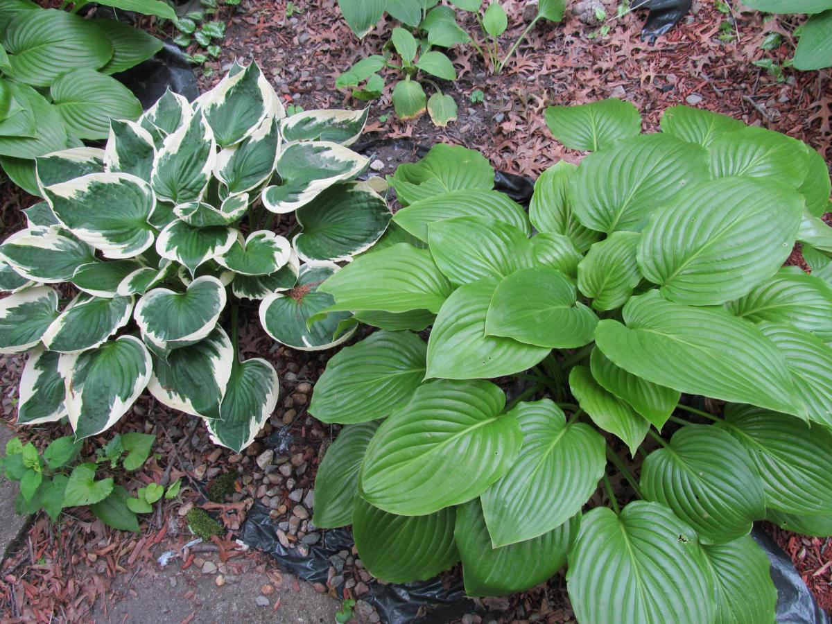
Green is a fabulous, fabulous color! Green has many, many associations and this is fortunate because green becomes a many splendored thing in the garden. Green is associated with money and prosperity, nature, abundance, growth, generosity, forgiveness, fertility and envy. It is considered a conservative color, and is also strongly masculine.
When you use green in the garden, it feels peaceful, harmonious, and nurturing. Japanese gardens where green is the primary color feel safe, sanctified, and above all, calming. It has been scientifically proven that green is the easiest color for the human mind to process, and the one we find most reassuring. This is why surgeons where green scrubs in operating rooms.
Green also provides a place for the eye to rest, and this “negative space” is very important in a garden. Try and have at least one green “expanse”, if possible. This can be in the form of a lawn, groundcovers such as junipers or sedums, or even low, lush green shrubs. You will also never run out of shades of green to use, and it is an essential part of every garden.
Blue
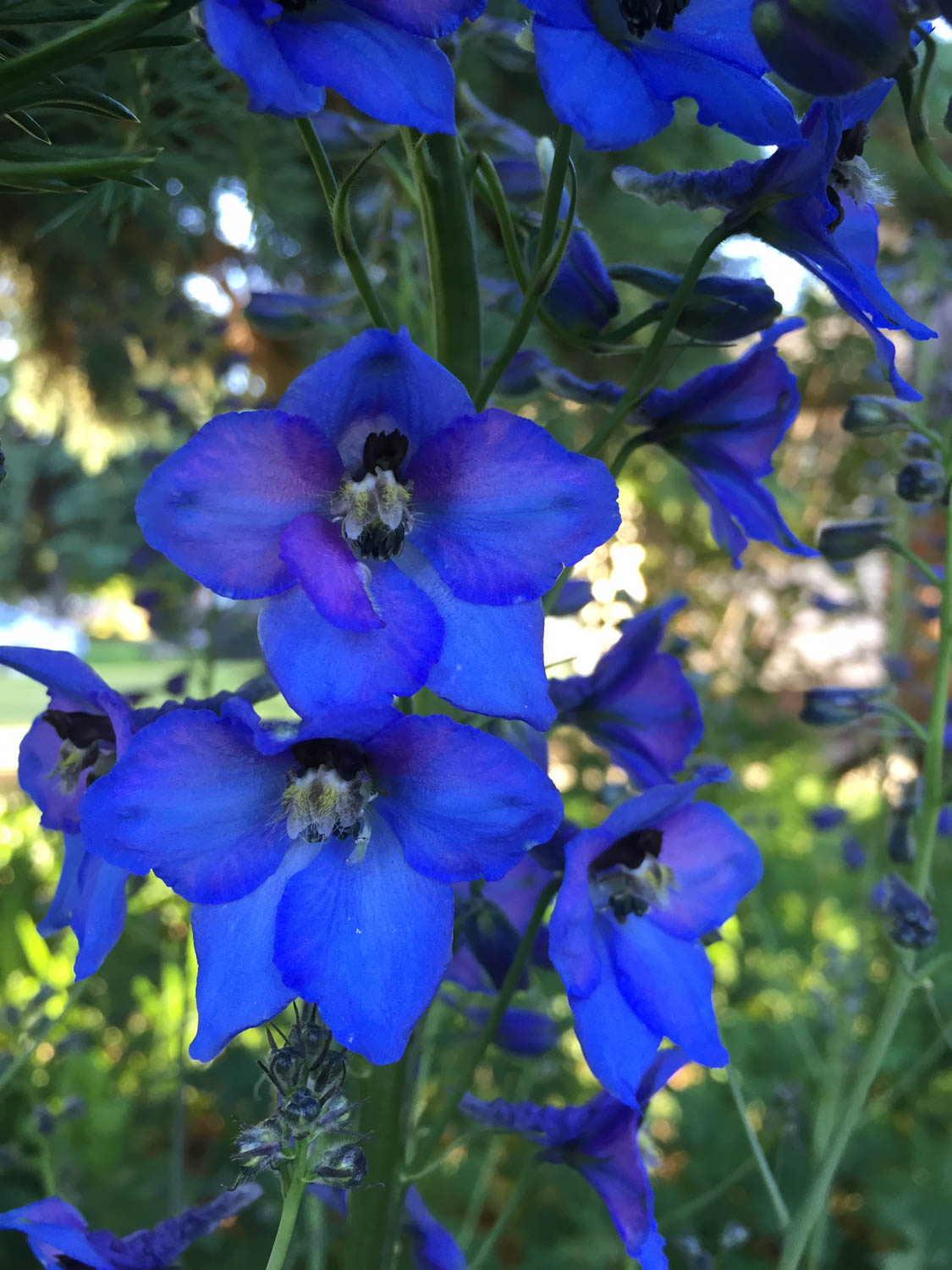
Blue is the color of the skies and seas, and causes the mind to focus. Blue is soothing, cooling, and like green, can be very calming. Blue is also sometimes a difficult color to pin down in the garden, because most of what is sold as “blue” flowered plants are actually some shade of purple. That said, there are some excellent, true blue flowers out there that can be dazzling in a garden.
Blue foliage can sometimes fill the role of blue flowers and there is more choice than you might think. Blue fescues, blue hostas, dwarf blue spruce, and blue junipers can all give you a shade of blue. There are also stunning blue ceramic pots that work. Blue combines well with pinks, whites, silvers, purples, mauves, and lavenders.
Too much blue in the garden can make it feel cold and uncaring. Blue summons feelings of steadfastness, dependability, wisdom, and loyalty. Ask people what their favorite color is, and most of them will say blue. Some excellent true blues for the garden include delphinium, meconopsis, veronica, gentian, and lobelia.
Purple
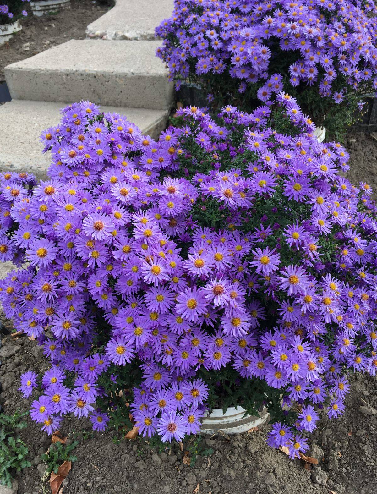
Purple is an abundantly available color in the garden, both in flowers and in foliage. For thousands of years, purple has been associated with royalty. In the garden, it creates the feeling of wealth, prosperity, and sophistication. Mysteriousness, wisdom, and respect have also been associated with purple. Purple combines well with pinks, silvers, and blues.
Do not put purple flowers in shady spots unless they are a very pale purple as purple will disappear under shadow. Purple also seems to absorb light, and has been associated with turbulence and anger if overused. Trees and shrubs with purple foliage create a “storm cloud” effect in the garden. If overused, they make a garden feel crowded and troubled. Think of streets lined with purple leafed flowering crabs or ‘Schubert’ chokecherries. Do those streets feel roomy and inviting, or do they feel dark and foreboding?
Good purples for the garden include fall asters, cranesbill, clematis, iris, and alliums.
Pink
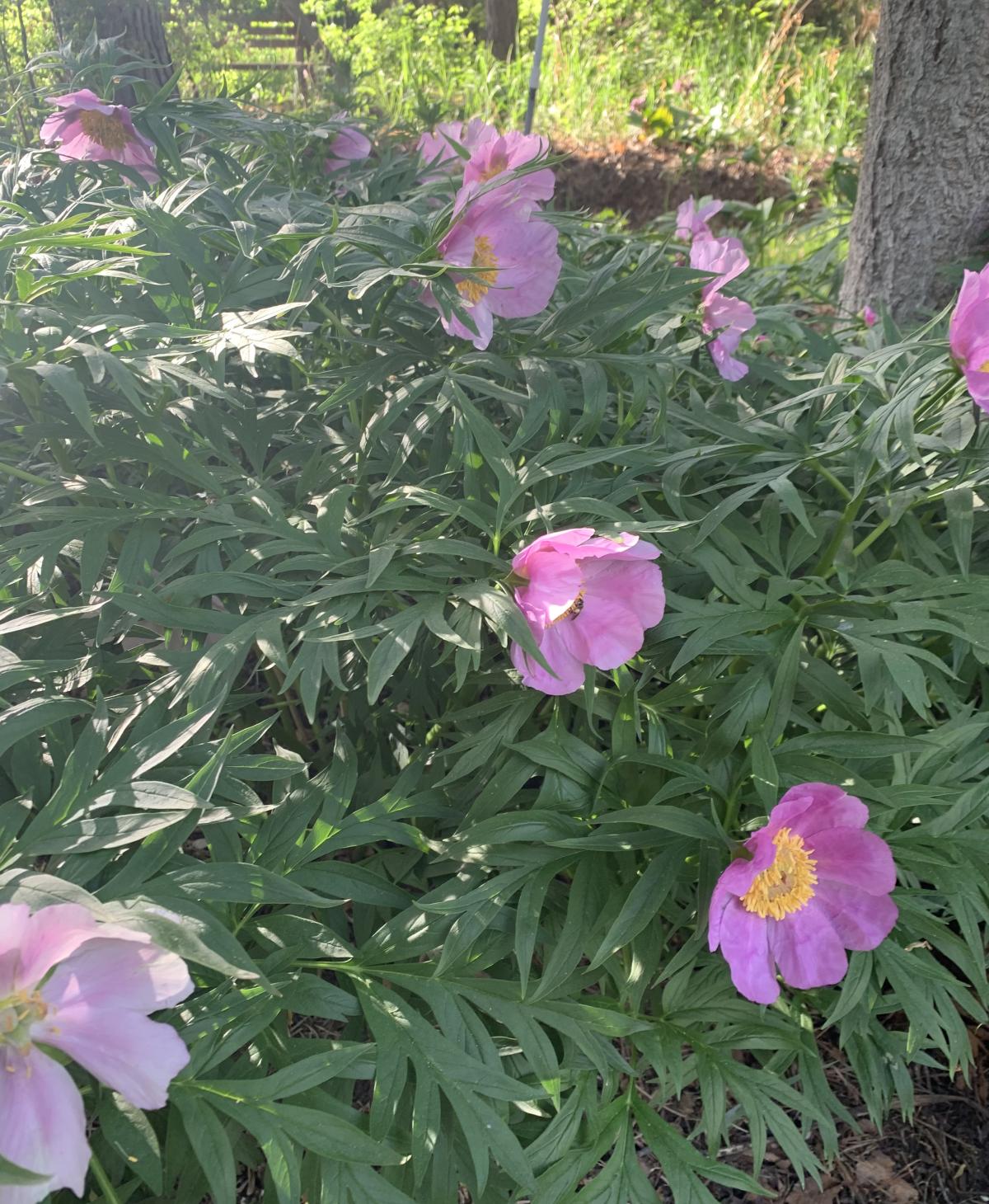
Pink is the true color of romance. It has all the emotion of red, but not the intensity. Pink in the garden is associated with gentleness and love, and is known to calm aggressive feelings.
It is very easy to overuse pink in the garden. Too much pink in the garden is “too sweet”, and to some people it feels like an emotional ice cream headache. An overabundance of pink drains energy. Pink is best with whites, purples, silvers, and some shades of blue. Combining it with red is dramatic but does not work in every garden. Like yellow, pink does better in the garden as a supporting actor, rather than in a leading role.
Excellent pink flowered plants include carnations, roses, lilies, colombines, and fleabane.
Black
Black is not so much a color so much as it is the absence of color. Black is neutral, and is associated with authority, power, stability, strength, and intelligence. Black can be slimming and make large things appear smaller or thinner, but it should be used sparingly. Too much black overwhelms, and brings about feelings of death, evil, and grief.
Black is not a common flower color, but there are some purples and reds that appear so dark as to be nearly black. (Think of black tulips or black hollyhocks.) If used well, black can be stunning with white or silver. Black can also be used with blue or green to good effect.
Brown
Brown is an underused color in the garden, as it is not flashy and does not demand attention. This can actually be an attribute when it is used correctly. Brown is traditionally the color of the earth, and it is also associated with reliability, stability, humility, friendship, nature, and organization. Brown pots and containers are good choices for plants with shades of green, olive, coppers, and bronze. Brown is also good with yellow in some cases and can also be used with orange. In India, brown is the color of mourning.
Grey
Grey is a combination of black and white, and therefore it too, is considered neutral. Grey is associated with old age, death, destruction, hopelessness, and a feeling of being lost. (Hence the term “grey area”.) Grey, however, is the sister of silver, and silver is very much different in the garden. Silver can be used in place of white, and it is generally more sophisticated. There are few plants with silver flowers but quite a number with silver foliage. Silver foliaged plants usually have this as an adaptation to growing in hot, dry areas. (Think of Artemesia, buffaloberry, and Russian olive.) Silver is excellent as an accent, and can be used to draw attention to plants that are more flash and dazzle.
Make a Plan
If you enjoy your garden, you are going to be in it every day and you can make it feed your soul too by making coscious choices. Every day you are going to be around various colors. It is up to you to choose how you want to feel in your garden, and how you want others to feel when they visit you in this garden. Color is something that you need to be thoughtful with, and something you strongly need to consider.
You also must learn to be relentless with color. If something “isn’t working”…yank it out! Or move it to a part of the garden where it does work. Or perhaps you have a chesive color scheme in one part of the yard, and a plunking garden bed where you don't care about color simply because you want to experiment. Decide what works for you, but by all means make this a choice rather than a passive happenstance.
Embrace Change
It is also important to remember that a color scheme in the garden can change with the seasons. For example, maybe your spring garden is predominantly pinks and whites and blues. Maybe by mid summer, it is more golds and greens and yellows, and in fall, it’s lots of purples and reds and oranges. This is fine. You do not have to try and make a color scheme last indefinitely.
It is also important that you get the opinions of other gardeners. Sometimes, you need to see the garden through fresh eyes, through someone else’s vision. Get a friend over (gardener or not) and say “walk around in my garden. How does it make you feel?” Women see things differently than men, and it is important that men get a woman’s opinion on the garden and vice versa. Be critical; accept and look for constructive criticism from others. This will help you make a better garden. Plant the things that you love, plant the flowers that mean the most to you, but try to plant things in a color-wise fashion. Also try and make sure you have fun! That’s what gardening is all about.
Learning About Colour and Design
There are also plenty of gardeners who have written about color and their work is worth investigating. We recommend Gertrude Jekyl, Christopher Lloyd, and Thomas Hobbs. Gertrude Jekyl is a very famous English gardener who has influenced gardens for decades. Her book Color Schemes for the Flower Garden (first published in 1914) is a “go-to” reference for designing with color in the garden for many gardeners. Christopher Lloyd (the British gardener and not the actor from the ‘Back to the Future’ movies) was positively brilliant with color and garden design. Finally, Thomas Hobbs is a Canadian garden writer who owns and operates Southlands Nursery in Vancouver. He has published two books, one is called ‘The Jewelbox Garden’ and the other is called ‘Shocking Beauty’. He is positively gifted when it comes to using both texture and color and his books are stunning.

